
Design System
2 listings
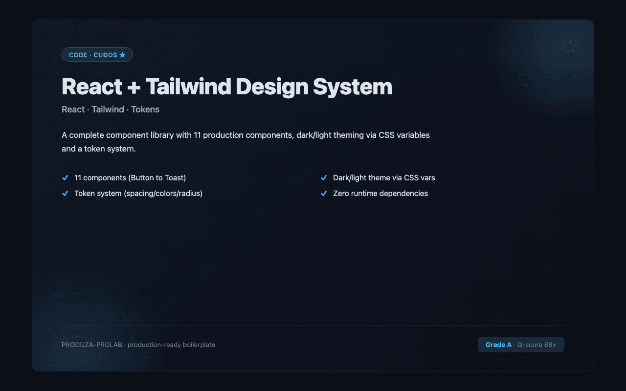
A90
by PROLAB® · Design SystemVerified✦Vibe Coded
ReactTypeScriptTailwind CSS
$35
Component libraries, design tokens, and Figma kits that bring consistency and accessibility to your product.
A design system is only useful long-term if it's consistent and accessible. Look for components that handle keyboard navigation, ARIA labels, and dark mode. Check that the token system (colours, spacing, type) is documented — undocumented design systems become maintenance debt fast. High documentation scores on CodeCudos listings indicate the component API is well-explained with usage examples.
Common stacks in this category
shadcn/uiRadix UITailwind CSSFramer MotionStorybook
Related categories
Frequently asked questions
Is shadcn/ui a design system?▾
shadcn/ui is a collection of copy-paste components, not a packaged design system. Most CodeCudos design systems are built on top of shadcn/ui or Radix UI with custom tokens.
Will the design system work with my brand?▾
Quality design systems expose colours, spacing, and type as CSS variables or Tailwind tokens. Swapping brand colours should be a config change, not a search-and-replace.