
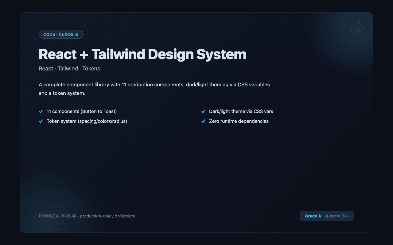
A production-ready React + Tailwind design system with 11 hand-crafted components, a token system, and dark/light theming via CSS variables. Zero runtime dependencies.
.dark classtokens.tscx() utility — clean className mergingnpm install # import components from src/index.ts
React 19 · TypeScript · Tailwind 3 · CSS variables
Heuristic score: 90/100Verified
Static zipball scan — not a live ESLint or Semgrep run. Last scanned
No reviews yet. Purchase to leave a review.